The Confectionary
A food procurement mobile application
The Confectionary
The Confectionary is a food procurement app for high quality coffee and baked goods. It will provide services to working professionals and personnel that seek to streamline the ordering process for baked goods. The Confectionary will provide tracking for customer loyalty rewards, previous orders and favorite products.
UX/ UI Designer
User research, user testing, low, mid, and high-fidelity wireframes
Duration
8 Weeks
Tools
Figma, Miro, Mockuuups, Adobe Stock
How can we assist people with the ordering experience of baked goods and coffee?
Background
In a world where convenience and quality go hand-in-hand, The Confectionary emerged as a response to the growing demand for exceptional coffee and pastries. Recognizing the contemporary lifestyle that values both convenience and indulgence, the creators of The Confectionary envisioned a solution that not only streamlines the procurement process but also ensures an unmatched culinary experience.
Industry
The coffee and pastry industry is experiencing a shift towards premium quality products, driven by consumers' willingness to pay for exceptional flavors and artisanal craftsmanship. Technology-driven convenience through food delivery apps has become integral to modern consumer behavior. The third-wave coffee movement emphasizes origin and flavor nuances, while local and sustainable sourcing practices are gaining traction.
Challenge
With an increasingly informed and health-conscious customer base, there is a demand for an app that offers a curated selection of top-tier products while ensuring seamless customization, sustainable sourcing, and an educational experience. The Confectionary seeks to bridge the gap between exceptional culinary offerings and modern consumers' need for convenience, personalization, and transparency in the coffee and pastry procurement process.
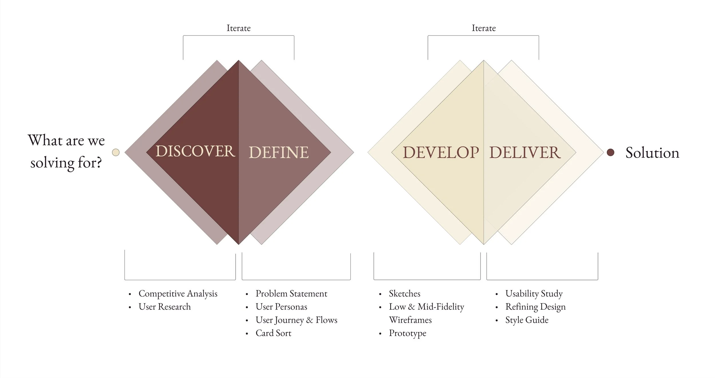
Double Diamond
An iterative design process was chosen for the development of this bakery ordering app, the Double Diamond process was selected for its user-centered approach, which aligns with the goal of creating a seamless and satisfying user experience.
DISCOVER
What is out there?
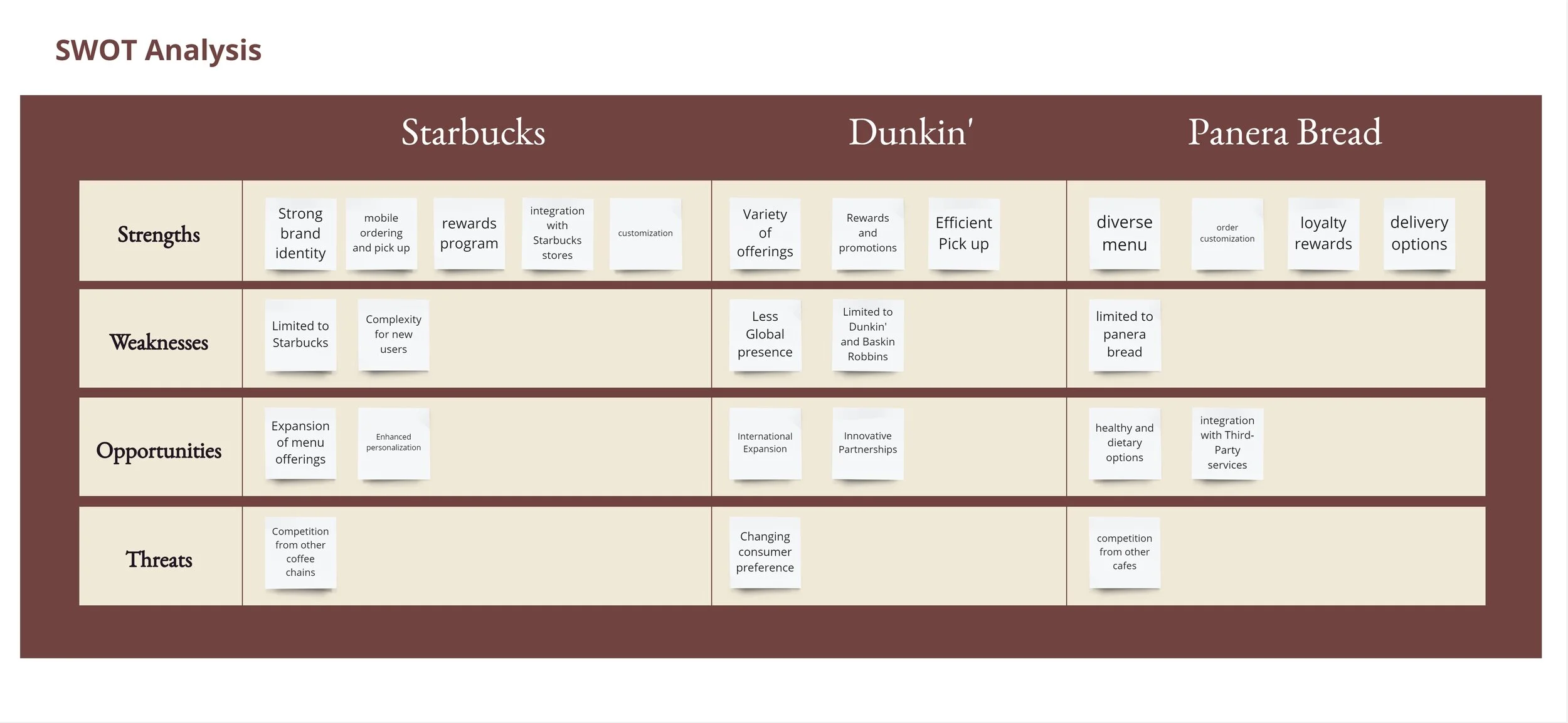
For this bakery ordering app development, a competitive analysis was essential to identify market gaps, learn from successful practices, innovate for differentiation, design a user-centric experience, anticipate challenges, and effectively position our app to cater to user preferences while standing out in a competitive landscape.
The key competitors examined during this analysis was Starbuck’s, Panera Bread, and Dunkin’ Donuts. These were selected due them the popularity of their apps, and commonality in specializing in coffee or baked goods.
Competitive Analysis
What was learned?
Identifying Market Gaps
Panera Bread: Potential gap in highlighting nutritional benefits and dietary options for health-conscious consumers.
Dunkin': Gap in providing premium coffee experiences with a focus on single-origin beans.
Starbucks: Gap in specialty baked goods and a stronger emphasis on localized food offerings.
Learning from Best Practices
Panera Bread: Opportunity to improve user engagement and retention strategies inspired by its loyalty rewards program.
Dunkin': Enhance customer experience and loyalty based on efficient mobile ordering and personalized rewards program.
Starbucks: Set a benchmark for user-friendly apps by incorporating technology for mobile ordering and seamless rewards integration.
Innovation and Differentiation
Panera Bread: Potential for innovation through sustainable packaging and local ingredient sourcing.
Dunkin': Room for differentiation by offering unique and customizable coffee blends.
Starbucks: Opportunity to innovate with AI-based personalized product recommendations and brewing techniques.
User-Centric Design
Panera Bread: Gap in offering seamless customization and clear dietary information.
Dunkin': Room for improvement in app interface to align with user preferences for simplicity.
Starbucks: Potential for enhancement in loyalty program transparency and simplicity for improved engagement.
Anticipating Challenges
Panera Bread: Challenge in maintaining consistency across a diverse menu and multiple locations.
Dunkin': Challenge in balancing combined Dunkin' and Baskin-Robbins offerings in the app experience.
Starbucks: Challenge in ensuring data security and privacy due to a large user base.
Market Positioning
Panera Bread: Opportunity to position as a destination for health-conscious and quality-seeking customers through premium ingredients.
Dunkin': Position as a convenient choice for on-the-go customers, leveraging fast service and comfort food reputation.
Starbucks: Position as an inclusive space for customers to enjoy diverse coffee experiences and cozy atmospheres.
User Research
The moment had come to discuss with bakery enthusiasts and gather their perspectives on the competition and their ordering experience. I conducted user interviews with individuals whom had varying degrees of familiarity with food procurement apps. My research goals were as follows:
Understand how bakery enthusiasts perceive and interact with existing bakery ordering apps, identifying pain points and user preferences to inform the design of a more user-friendly and engaging app.
Determine which features of existing bakery ordering apps are most valued by users and explore opportunities for innovation and differentiation to create a standout app that addresses users' needs and desires effectively.
Gain insights into how bakery enthusiasts perceive different bakery brands and apps, helping us refine our app's value proposition and positioning to ensure it aligns with user expectations and market trends.
Problem Statement
Tim is a tech-savvy software engineer who needs a bakery ordering app that offers a seamless and efficient experience because he values his time and convenience in managing his busy schedule. Insights reveal that Tim finds it frustrating when apps are slow or complicated, and he appreciates detailed information about products before making a purchase.
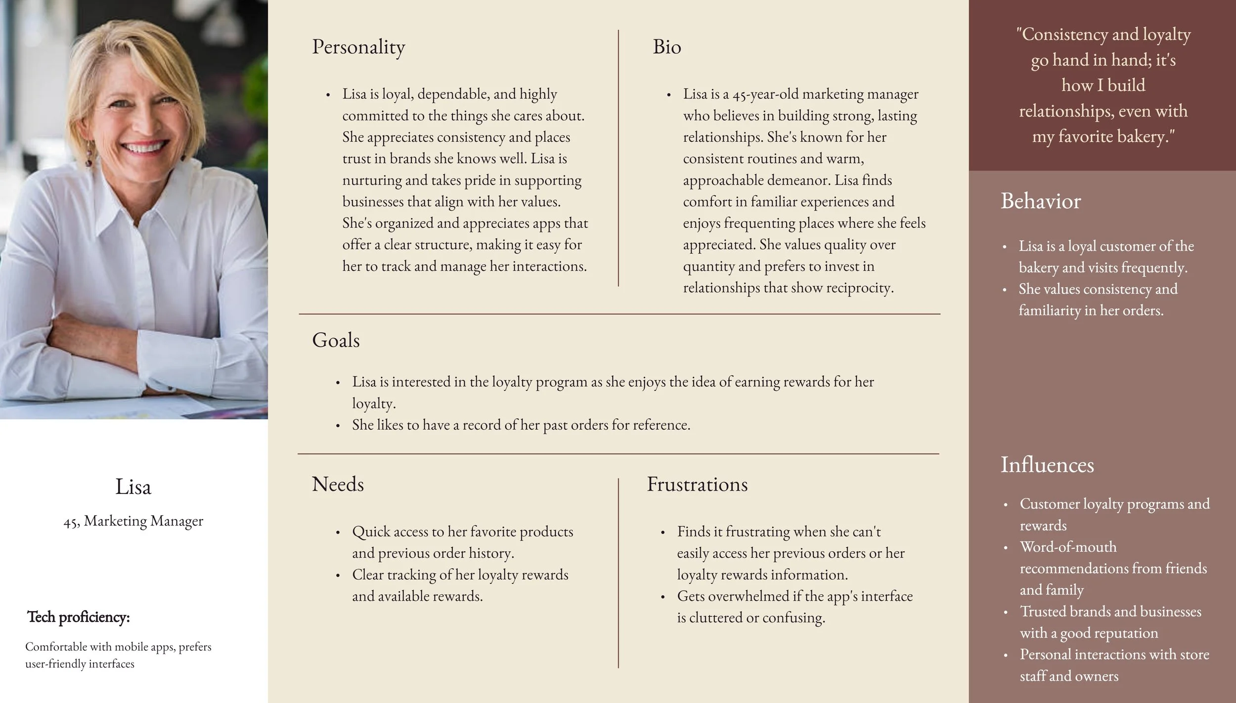
Lisa is a loyal marketing manager who needs a bakery ordering app that helps her easily access previous orders and loyalty rewards because she values consistency and building strong relationships with her preferred businesses. Insights highlight Lisa's frustration when she can't conveniently access her loyalty rewards or quickly reorder her favorite items.
Olivia is an adventurous college student who needs a bakery ordering app that provides a variety of options and allows her to try new treats on a whim because she enjoys spontaneous experiences. Insights show that Olivia prefers a simple and straightforward app experience, and she appreciates apps that align with her changing preferences.
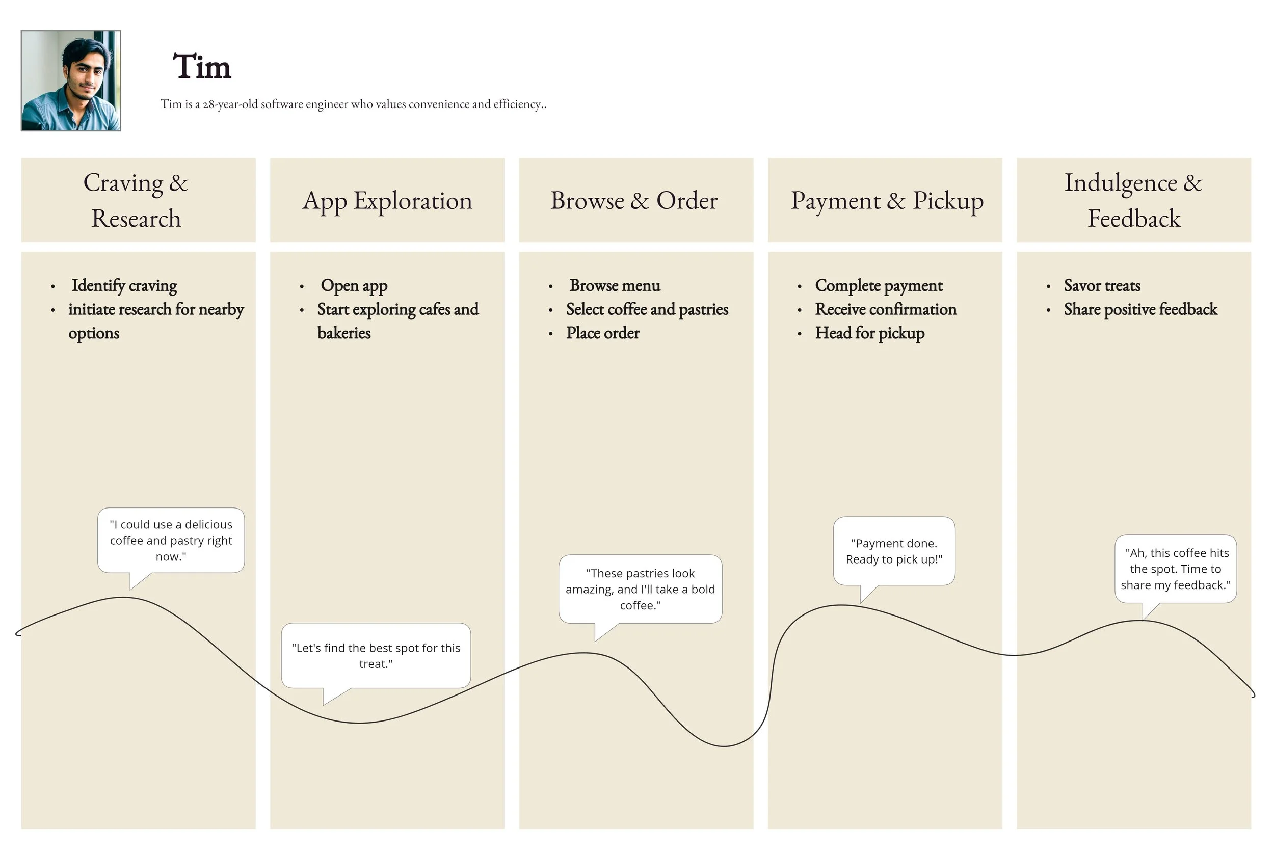
User Journey
Tim is a tech-savvy software engineer who needs a bakery ordering app that offers a seamless and efficient experience because he values his time and convenience in managing his busy schedule. Insights reveal that Tim finds it frustrating when apps are slow or complicated, and he appreciates detailed information about products before making a purchase.
User Flow
The user flow guided the app development by showing how users like Tim navigate the app. It helped streamline navigation, refine features, and optimize the order process. Insights from the flow led to an intuitive, user-centered design that enhanced features, resulting in a more engaging bakery ordering experience.
Low Fidelity Wire Frames
These wireframes focus on structure and functionality, allowed for quick iterations and concept validation.
Mid Fidelity Wire Frames
These wireframes provide a clearer vision of the app's design, helping to refine user interactions, identify potential design challenges, and ensure alignment with user needs before moving on to high-fidelity design.
Mock Ups
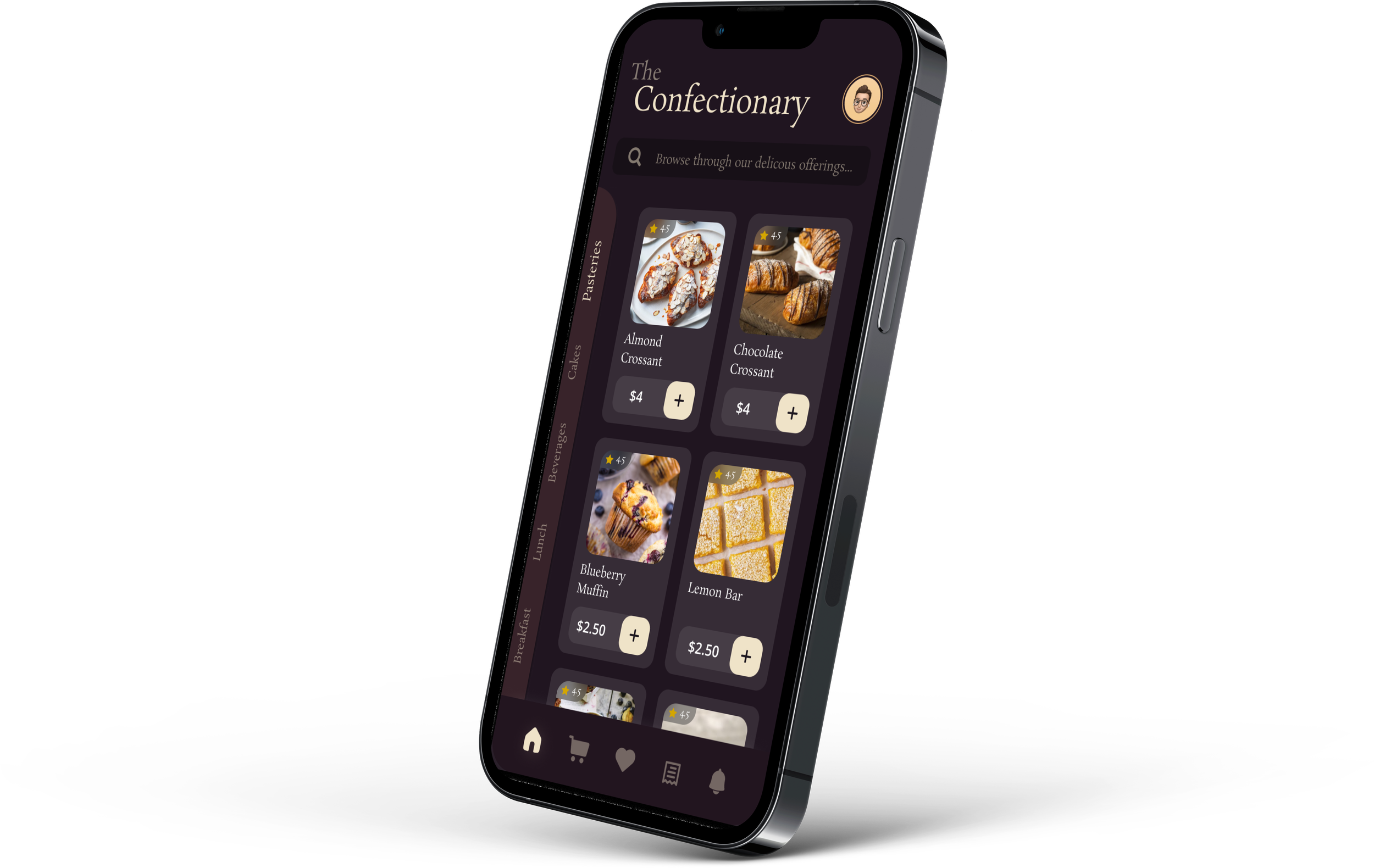
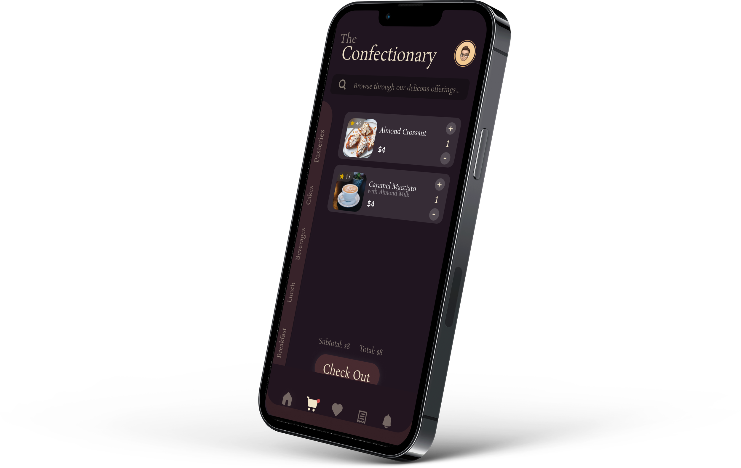
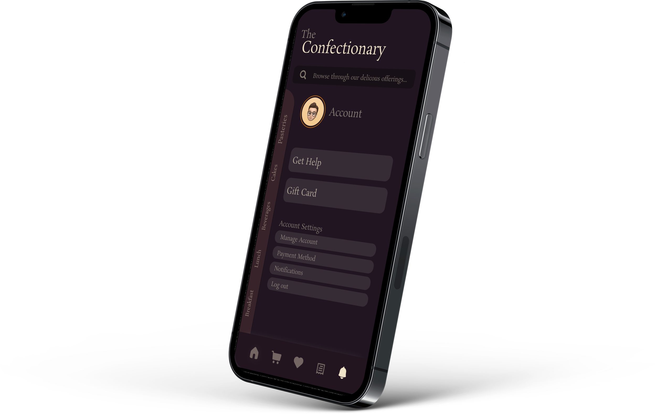
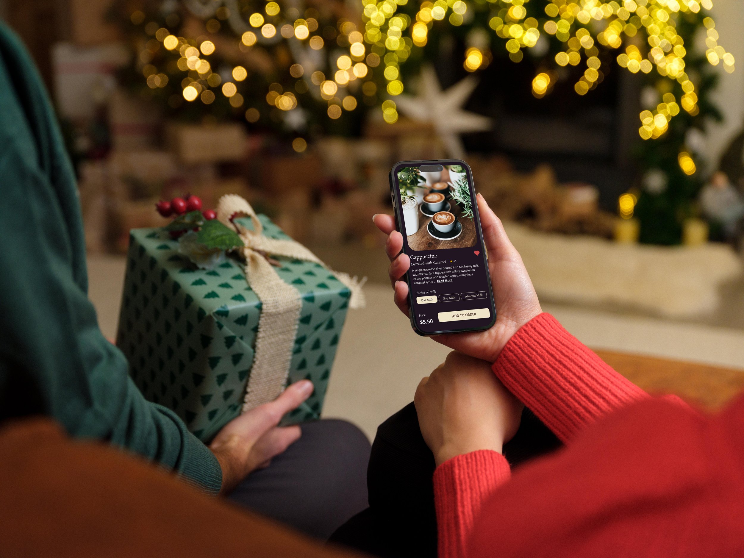
These high-fidelity mockups showcase the app's user interface, incorporating actual colors, typography, and visual elements. Mockups provide a comprehensive view of the app's look and feel, helping to visualize the final product and enabling stakeholders to review and provide feedback on the design before moving on to development.
Menu
Cart
Order Confirmation
Account
Usability Study
The usability study aims to evaluate the effectiveness, usability, and user satisfaction of the refined app mockups and prototype. Insights gained from user interactions will guide further design refinements before proceeding to the development phase.
Participants
A diverse group of 10 participants representing the app's target audience
Methodology
Task Scenarios: Participants were given specific scenarios to complete, such as customizing an order, tracking loyalty points, and accessing previous orders.
App Interaction: Participants interacted with the refined mockups and prototype, performing tasks as outlined in the scenarios.
Think-Aloud Protocol: Participants were encouraged to express their thoughts, expectations, and feedback while navigating the app.
Observation and Note-Taking: Researchers observed participants' interactions, noting usability issues, pain points, and areas of success.
Post-Task Questionnaires: After each task, participants provided feedback on their experience, ease of use, and any challenges faced.
User Satisfaction Survey: At the end of the session, participants complete a survey assessing their overall satisfaction with the app's design and functionality.
Key Metrics and Objectives
Task Completion: Evaluated the percentage of tasks successfully completed by participants.
Efficiency: Measured the time taken by participants to complete tasks.
User Satisfaction: Gathered feedback on the overall app experience, visual appeal, and ease of use.
Usability Issues: Identified and documented any usability issues encountered during the interaction.
Outcome
Insights gathered from this usability study will provide valuable data for refining the app's design, addressing usability challenges, and enhancing the user experience. By involving representative personas and considering their feedback, the study will enable the development team to make informed decisions for further optimizing the app's mockups and prototype before moving forward with development.
Style Guide
DEFINE
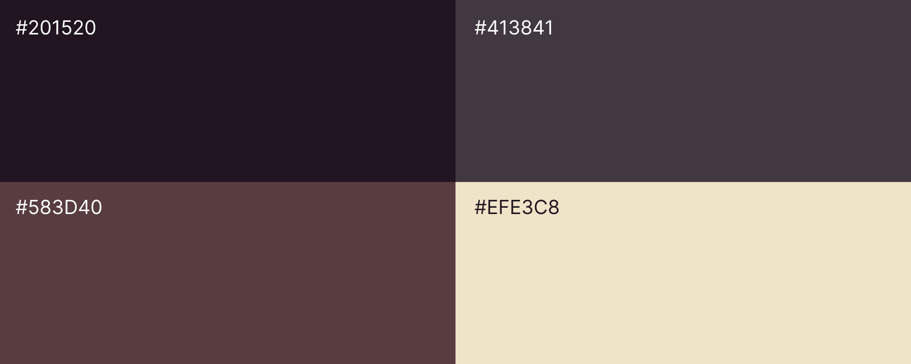
The app's style guide adheres to a clean and modern design ethos, aiming to create a visually appealing and user-friendly experience. The primary color palette consists of warm, inviting tones to convey a cozy bakery ambiance, complemented by neutral hues for text readability. The typography employs clear, legible fonts for both headings and body text. Visual elements, such as images and icons, reflect a friendly and food-centric theme, maintaining a cohesive and appetizing feel. The app embraces a mobile-first approach, ensuring responsive design across various devices. Interface elements are intuitively placed for easy navigation, and animations are subtle, enhancing user engagement. Consistency in layout, color usage, and typography fosters a seamless and enjoyable user experience.

