Kaya Yoga
Ground-Up Brand Development for a Mindful Movement
Project Overview
Client Introduction
Kaya Yoga is a boutique yoga studio aimed at providing personalized and small-group yoga experiences. The client sought to create a brand that reflects their commitment to mindfulness, balance, and individual growth through yoga practice. Their mission is to offer a welcoming space where both beginners and experienced yogis can deepen their mind-body connection.
Purpose of the Project
The project was a brand launch, requiring the development of a full visual identity, including logo design, social media assets, and a website. The goal was to establish Kaya Yoga as a wellness destination that emphasizes personalized instruction, community, and holistic well-being.
Target Audience & Market Segment
The target audience consists of wellness-oriented young professionals in their 20s to 40s who value a holistic lifestyle. They are seeking balance in their busy lives and are interested in yoga as a way to enhance both mental and physical health. The market segment includes individuals who prefer small-group classes or one-on-one sessions, where personal attention is key.
Key Goals & Challenges
Brand Identity: Creating a calming and welcoming brand identity that resonates with the values of mindfulness and wellness, while standing out in a competitive market.
Connection: Ensuring the brand fosters a sense of community while maintaining the personalized approach that is core to Kaya Yoga's offerings.
Targeted Reach: Attracting wellness-oriented clients through effective branding and digital marketing strategies, particularly focusing on a niche audience.
Challenge: Positioning Kaya Yoga as a unique offering in a saturated market, where many studios offer similar services, required a distinct visual and messaging strategy that highlighted its personal, boutique approach to yoga.
Visual Identity
Logo Design:
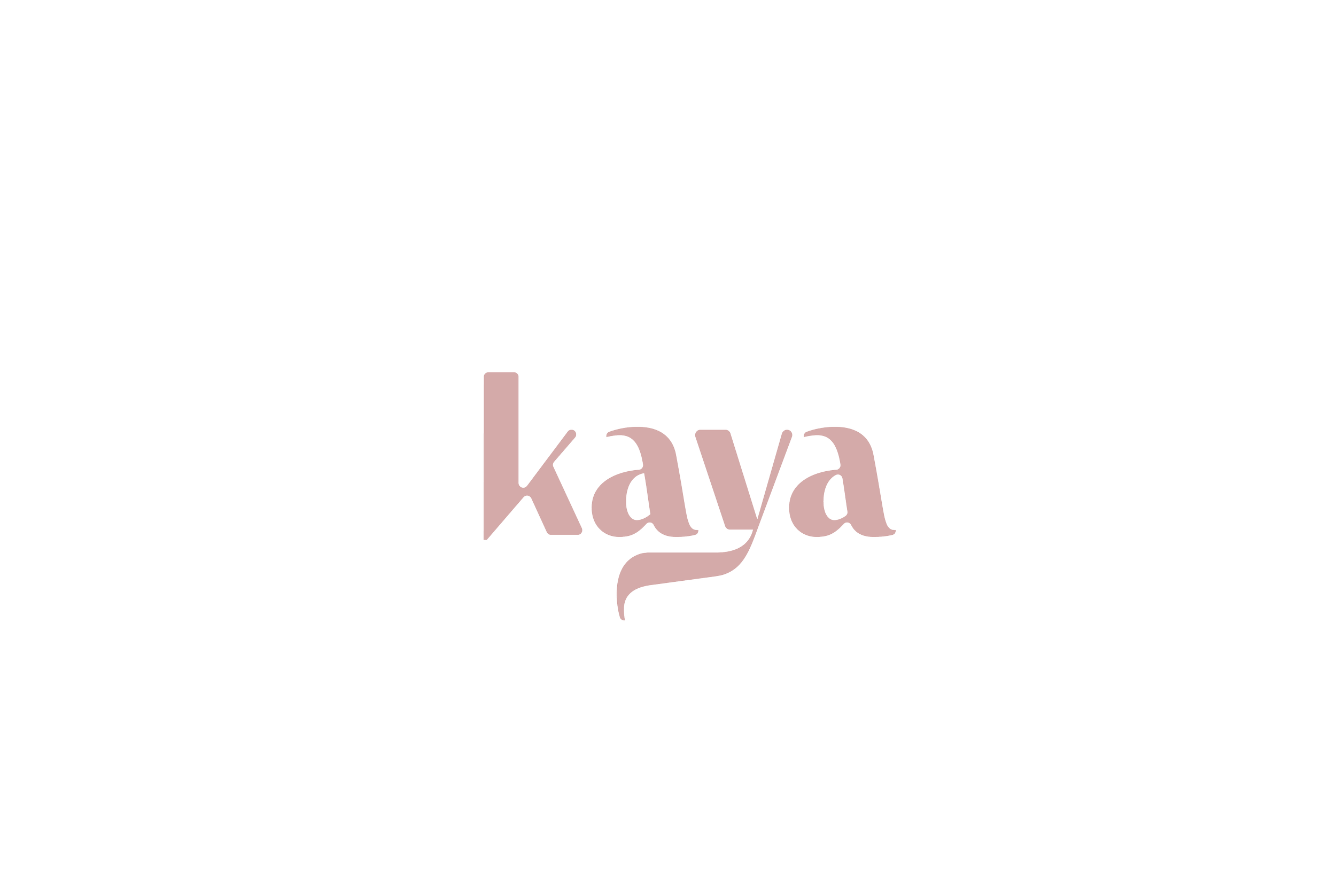
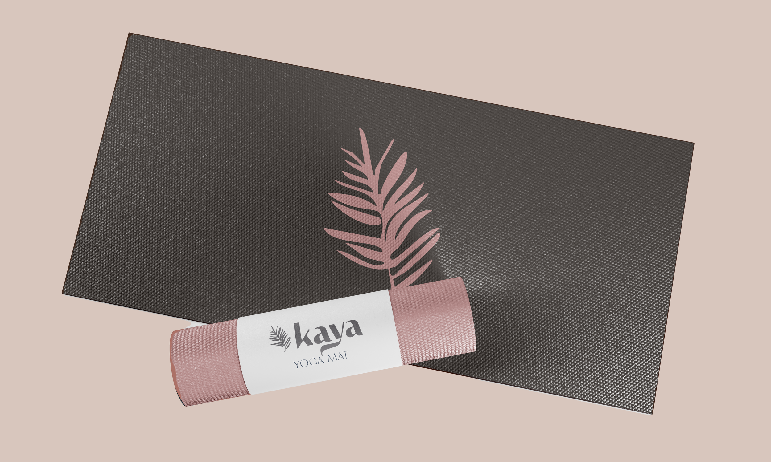
The design features a modern, minimalist wordmark with flowing, organic lines, symbolizing the fluidity and grace of yoga practice. The soft, rounded typography is designed to evoke a sense of calm and openness, while the custom "Kaya" lettering incorporates a gentle wave-like curve, representing the natural ebb and flow of breath and movement.
The overall aesthetic is clean and approachable, aligning with the studio’s focus on mindfulness and community. The logo is versatile, making it ideal for both digital and print media, and it reinforces Kaya Yoga’s identity as a welcoming, peaceful space for individual growth and connection.
Graphic Designer
Client and Market research, Color Palette development, Brand development, graphic design
Duration
6 Weeks
Tools
Adobe Creative Cloud (Indesign, Photoshop, Illustrator), Adobe Stock
Brand Strategy for Kaya Yoga
Research and Strategy
The brand strategy for Kaya Yoga was built on comprehensive research into the wellness and yoga markets. The focus was on identifying trends in boutique fitness, personalized instruction, and mindfulness practices. Insights were gathered through competitive analysis, audience research, and an understanding of the growing demand for yoga as a tool for stress relief and personal growth. This research informed the development of a distinct brand identity that emphasizes serenity, balance, and the personal touch offered through small-group and one-on-one classes.
Core Brand Values, Messaging, and Tone of Voice
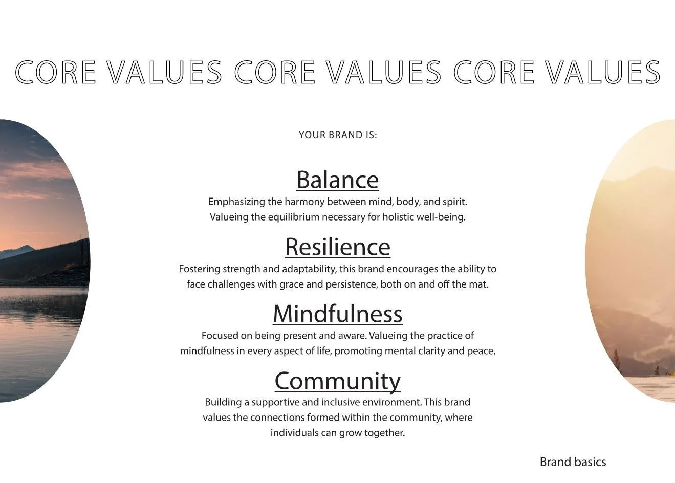
Kaya Yoga’s core values—balance, mindfulness, community, and resilience—are woven into the brand’s messaging and visual identity. The tone of voice developed for Kaya Yoga is warm, welcoming, and inclusive, with a focus on encouraging personal growth and self-discovery. The messaging emphasizes a calm and nurturing environment where clients can find peace, strength, and a deeper connection to themselves through yoga. The brand consistently communicates that yoga at Kaya is more than just physical—it’s a holistic journey toward well-being.
This strategy ensures that Kaya Yoga stands out in the wellness market as a boutique studio that offers personalized, transformative experiences, making it a go-to destination for those seeking a deeper connection between mind, body, and spirit.
Color Palette:
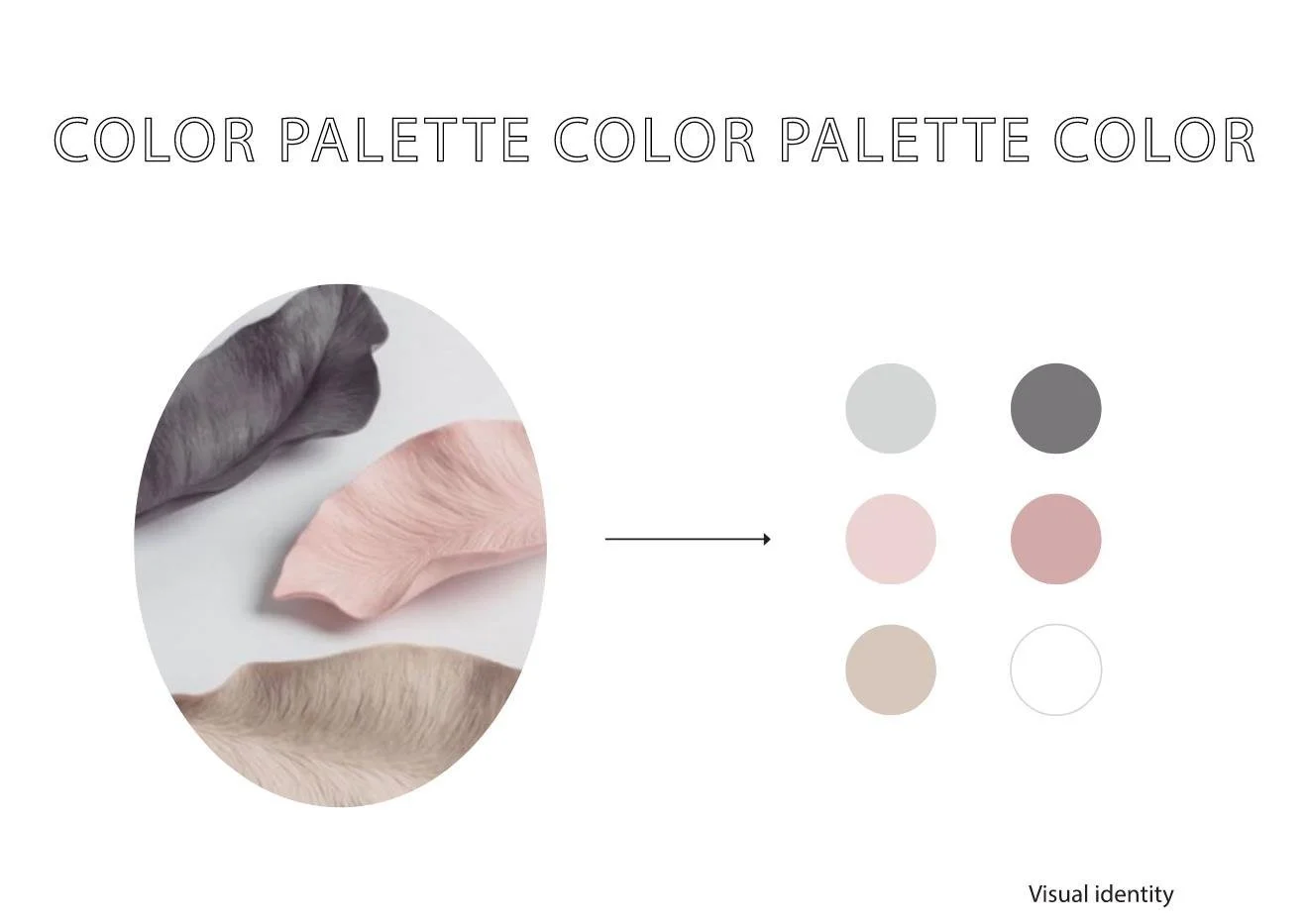
The color palette for Kaya Yoga features a serene and harmonious combination of charcoal grey, light grey, beige, white, light pink, and blush, designed to evoke a sense of tranquility, balance, and warmth. Each color was thoughtfully chosen to reflect the core values of the brand
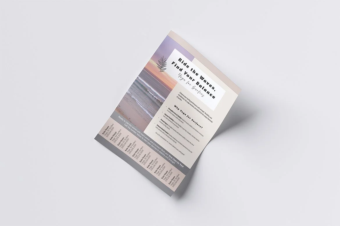
Brand Applications
Final Thoughts
The Kaya Yoga brand development project has been a resounding success, capturing the studio’s essence of balance, mindfulness, and community. The cohesive visual identity, including the logo design, color palette, and imagery, has helped create a brand that feels both calming and inviting, perfectly reflecting the values of the yoga practice. The brand strategy has positioned Kaya Yoga to stand out in a competitive market, focusing on personalized, one-on-one and small-group classes that cater to the individual needs of clients.
By aligning the brand with the client’s broader vision of providing a welcoming space for self-growth and wellness, Kaya Yoga is well-equipped to attract a dedicated clientele of wellness-conscious individuals. The brand not only resonates with the studio’s target audience but also supports the long-term strategy of expanding its presence as a community-focused, boutique yoga studio. This project has successfully laid the foundation for Kaya Yoga’s future growth and impact in the wellness industry.
Imagery:
The visuals often feature serene landscapes, such as mountains, oceans, and open skies, symbolizing the grounding and expansive nature of yoga practice. These natural elements reflect the studio’s focus on mindfulness, self-discovery, and inner peace.
The human element is highlighted through images of individuals practicing yoga in peaceful settings, often captured in moments of stillness or flow. These visuals emphasize the connection between mind and body, reinforcing Kaya Yoga’s personalized approach to well-being.
The color tones in the imagery mirror the brand’s soft, earthy color palette, with warm lighting and gentle contrasts, creating an overall sense of tranquility and inclusion. This visual approach helps potential clients feel the calm, welcoming atmosphere they can expect when they step into Kaya Yoga’s space.

